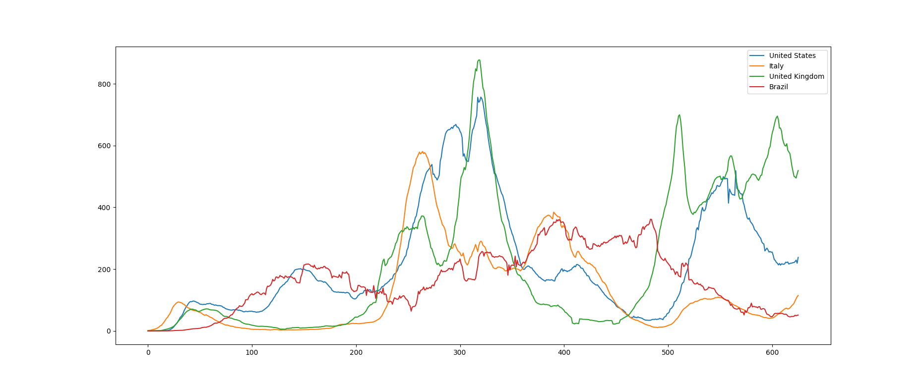
I’ve been exploring the possibility of sonifying covid case data from different countries. For instance a few of the countries’ new case data looks like this:
While I find the sonification process, the code and the result interesting, I find the choice of the topic a little bit macabre for my point of view. That being said, can you please explain how you sonify the time-series? Kind regards, from Germany
Totally understand how it might seem macabre! I just find the counterpoint between the different countries’ experiences kind of remarkable.
The way it works it that each violist alternates between two notes a fifth apart, with the alternation growing louder and faster as new cases rise. When new cases in the country get high enough, the bottom note starts to jump up an octave, and the notes start to bend increasingly out of tune.
Yeah, I feel like I stumbled on something that really worked. It’s simple enough to be clearly perceptible, and yet it’s not too simple — it has a richness to it. Sometimes you get lucky!